ARTist: Conor Nolan
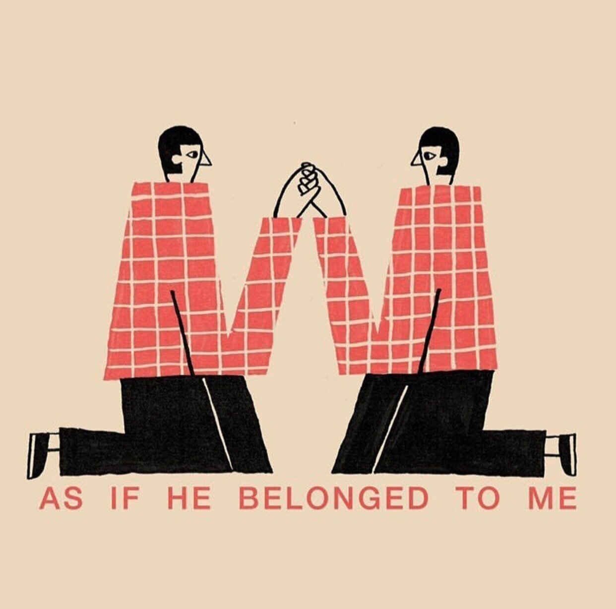
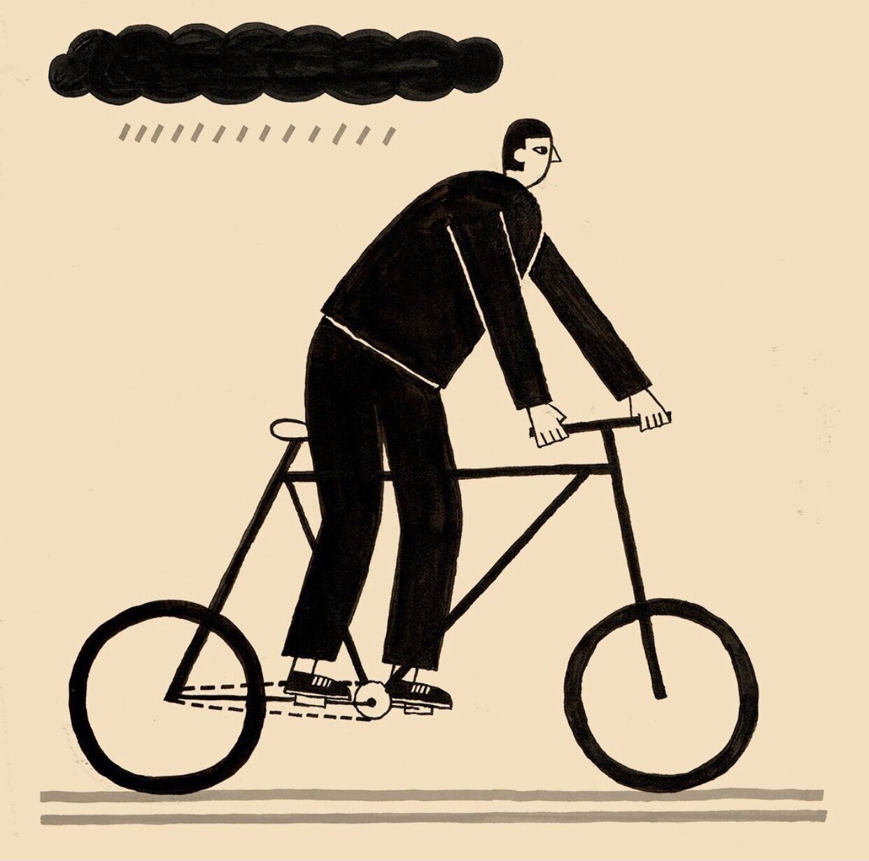
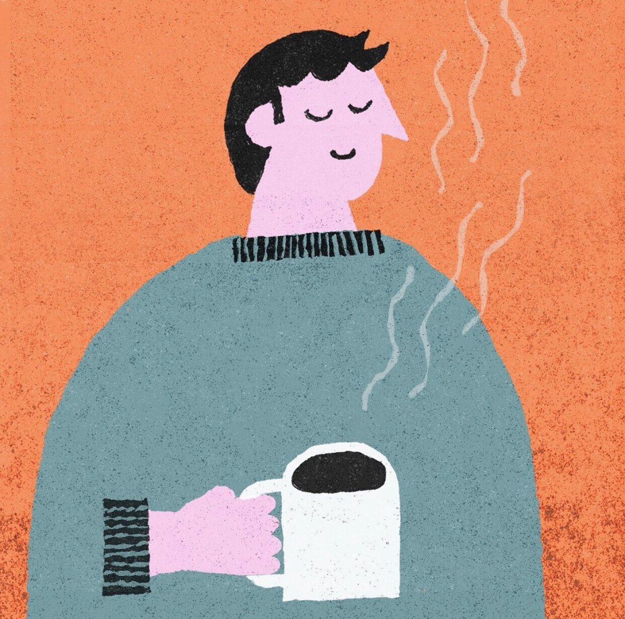
The second of our artist series features the work of Dublin illustrator Conor Nolan. A graduate from Dublin’s National College of Art and Design, Conor’s illustrations are colourful, fun and often feature lovable characters with alternate feelings of melancholy. We reached out to Conor last year and were delighted to come together to create the Coffee and Kooks artwork. We gave Conor a shout to find out a bit more about the man behind the pen.

For anyone that doesn’t know, give us a brief outline of your background?
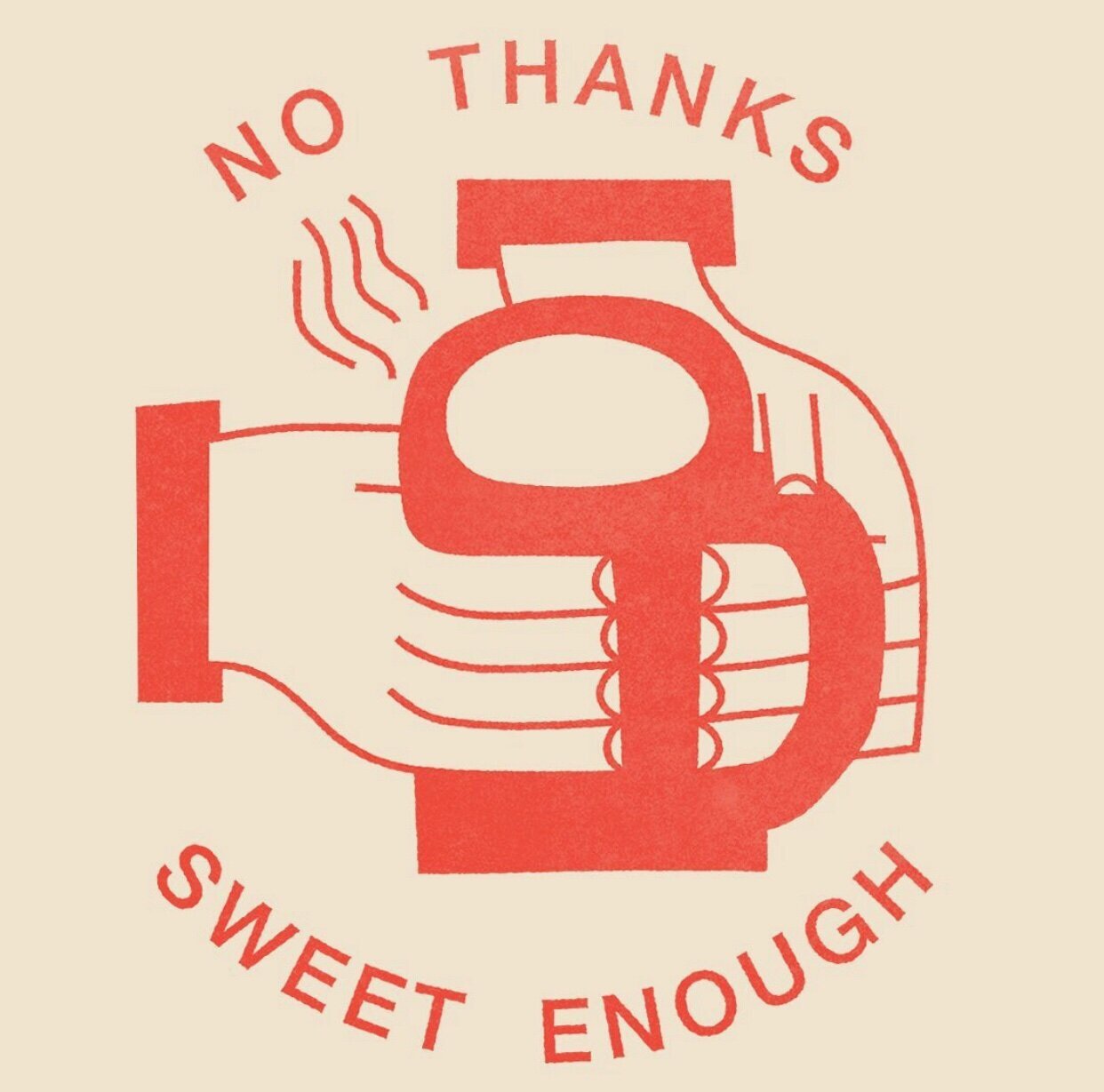
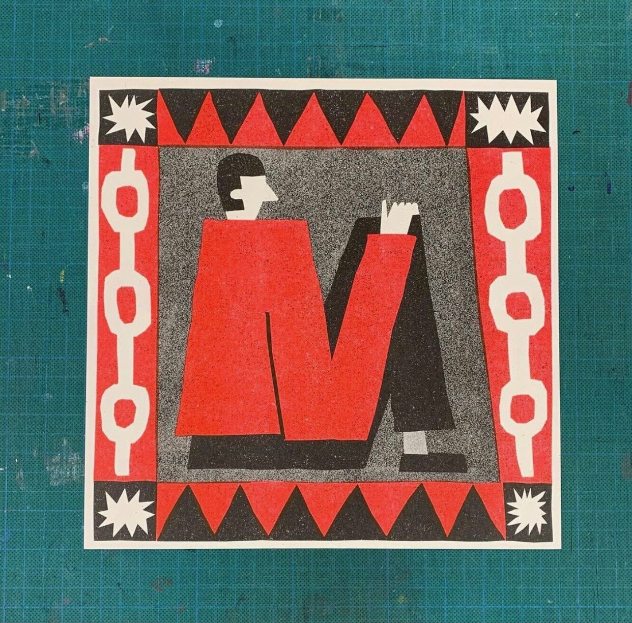
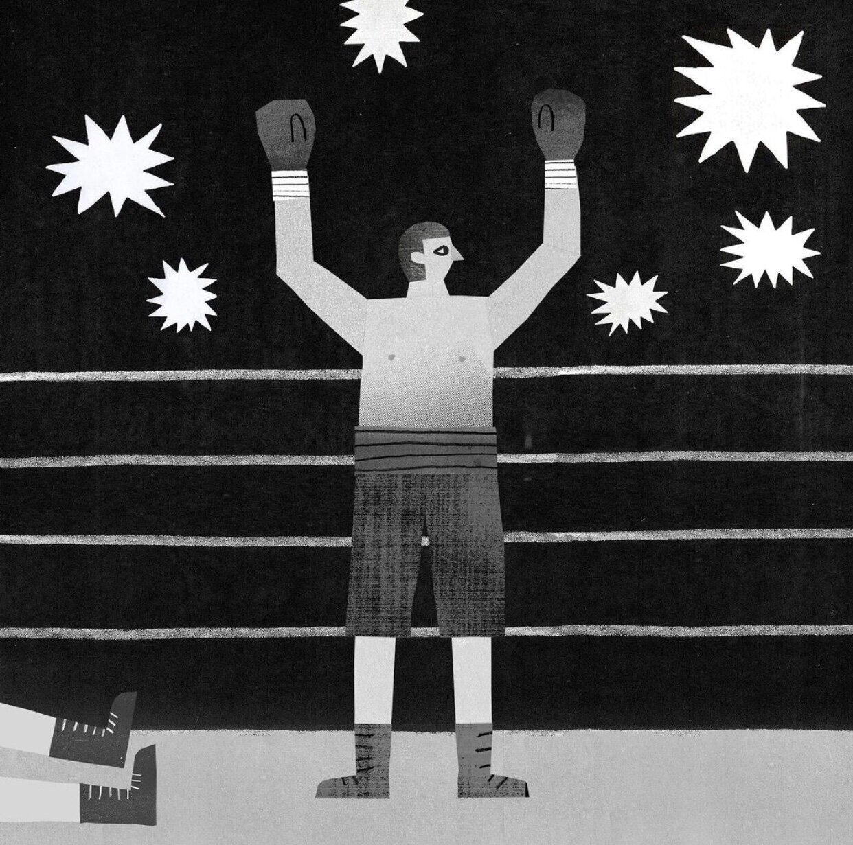
Hey! Well, I’m from Dublin, I’m an illustrator, have been doing it for about five years since finishing college at NCAD. The work I make varies a bit from project to project as I kind of bend the style of what I do around the brief. I use a variety of traditional (brush pens, ink, pencil) and digital media (Photoshop stuff with lots of textures) to do a lot of messing and try to find an interesting way to get from A to B for everything I do. I’m also really into printmaking and I think the format and process of what I’m making can inform how the finished product looks a lot of the time.
What’s been inspiring you lately?
I’ve been trying to get outside more. I moved into the city (Dublin) about a year ago and since then I’ve found myself really gravitate to any open space I can find, like to a park or to the sea. I’m trying to make time where I don’t have to be anywhere or do anything and I can just sit somewhere and watch people or animals do their thing, maybe draw while I’m there. I had great craic watching ducks for a while there today, I would highly recommend it.

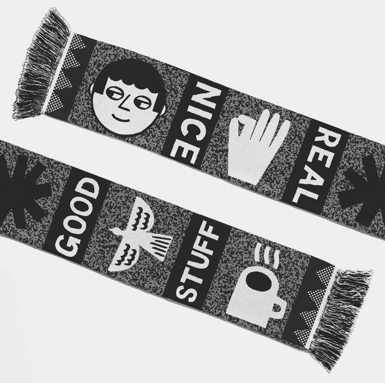
Give us a rundown of the Coffee and Kooks artwork?
The brief of this was very simple - coffee and surfing - and with that in mind I thought I would just shoot for a relatively simple but bold visual that could include both of those things. So I drew a character surfing a huge wave in a coffee cup. Sort of a storm in a tea cup kind of visual too, which is fun.
One thing that I really tried to remember when working on it was that the themes in the brief overlapped easily with this visual, and that I really didn’t need to force anything too much to make it work. It seems like it comes from a very simple place and I think that’s because it does. It was one of the first visual ideas I had for it, which felt kind of obvious, but in this case I thought it was obvious for a good reason, in that it worked very naturally. As I said sometimes there’s no need to force things when they’re right in front of you.

What’s your plans this summer and going forward?
I wish I knew! I’ll be heading out to Letterfrack to spend a bit of time with Design West making some mad stuff at the end of June. After that I’ll probably be spending my time here in Dublin before a trip out to Westport in August.
Lastly, tea or coffee? And what’s ya favourite biscuit?
If I’m out I get a cappuccino and if I’m home I’m a tea man.
I like a ginger nut or a hob nob.
For more from the collaboration head here or visit Conor’s website here.