ARTist: Chris McClean
Our first blog post. Our “hello world” moment. We said at the start of our online venture we wouldn’t do them, that they were naff, and that blogs were outdated; yet for numerous reasons, here we are. It’s a scary prospect, exposing yourself online, like standing naked in front of a mirror, but we’ve encountered so many interesting people, places and things in the short time we’ve been open that it felt right to start chronicling it. We hope, if you’re reading this, you’ll find something interesting, informative or useful here too. So without further ado, welcome! We hope you enjoy.
Chris McClean (ARTist Series)
I first met Chris in 2014 at a famous surf spot carpark in the north west of Scotland. What was meant to be a 4 day surf trip turned into a rambling 2 week camping and surfing trip through the highlands. You get to know someone pretty quick when you sleep next to them in a van and pretty soon I felt like I’d known Chris a lifetime. It was during this time that I learnt of his creativity, whether with camera, computer or campfire, he was always taking a different approach. Many in the surfing arena would be familiar with Chris’ beautiful films. He’s made some of the most widely watched European surf films of the last 5 years, but less would be aware of his acute skills as a graphic designer; skills he was widely recognized for at the start of his career. In the years since our first meeting, we’ve been on numerous surf trips, drank shitloads of bad coffee, worked on a magazine together and become great friends. At the beginning of foam, we were pretty clueless; opening a coffee shop, learning how to run a business and managing 3 people’s vision of their baby was tricky, but an equally epic experience. The branding and artwork Chris did with us right at the birth of foam was a pillar in guiding us and pretty much shaped what it is visually today.

For anyone that doesn’t know, give us a brief outline of your career?
From school? Fish filleter, landscaper, grave-digger, graphic designer, filmmaker/photographer.
You were a graphic designer before moving into cinematography. Tell us a bit about that? Where you worked, any particular projects you remember or enjoyed?
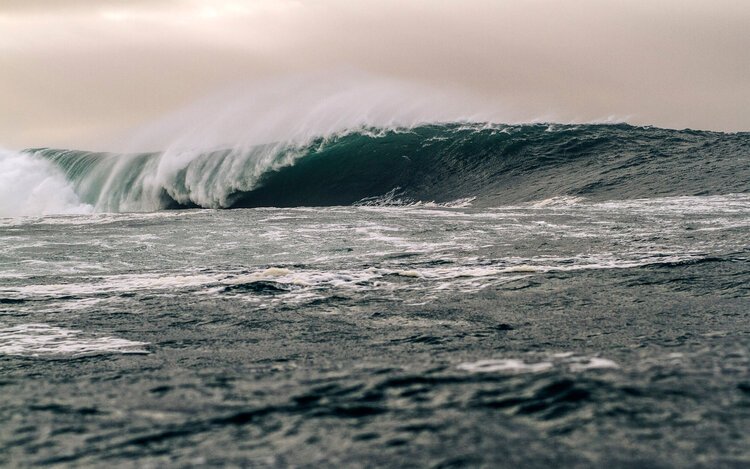
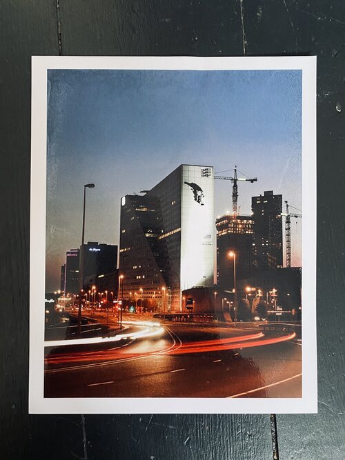
As a landscaper, I got caught sleeping on the job. I was weeding a massive garden but found a hidden little spot to rest my weary hungover head. After a dressing down, I realised I needed a way out. Graphic design sounded cool, so I applied to college and a new job followed not long after. That, in turn, lead me to win a student D&AD (the biggest Design awards going). And I found myself in demand from some of the best graphic design firms in the UK. I was offered a job at O’Neill in Amsterdam. Designing for a surf company sounded like a dream, so I found myself crossing the North Sea. The most memorable job at O’Neill was a billboard on the side of a multi-storey building in Rotterdam. We shot Gian Simmen bomb-dropping a building in Åre, Sweden. Before enlarging it and mimicking the multi-storey's facade so it looked like he was bomb-dropping the actual building. A crazy amount of work went into testing it out until it looked right. It looked insane all lit up. When I left it was a hard decision, it was a fun 4/5 years but I struggled with the way sales drove the marketing. A cool idea or concept was always second to ‘but how many tee-shirts can we sell?’
I asked you to help us at the start of foam with our branding and artwork. How did you find that? What was the idea behind the work and any inspiration used?
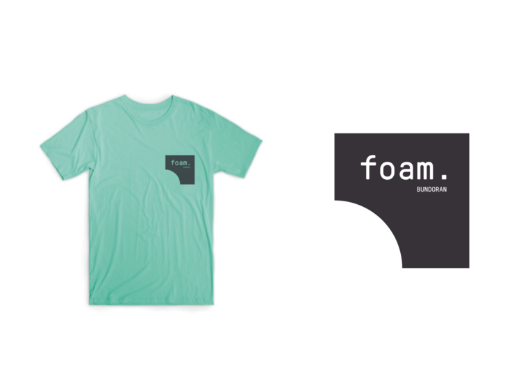
I love being able to dip back into graphic design. It’s a field that gives you a good grounding in all creative disciplines and makes you a well rounded creative. Interesting projects always intrigue me. From memory, you wanted a very simple typographic mark and to build upon that. For which we used Pressura Mono from Grilli Type. It's a simple sans font inspired by metal type printing or engineered letters stamped onto shipping boxes. We then created a very simple series of geometric shapes that referred back to the art of coffee making. And these shapes generated a language we could use across all branding. Colour combined with negative space stops the work from becoming too busy. And creates a simplistic yet effective style to use across all elements. There is an element of Saul Bass in the work, in the way the shapes can work as a mismatched jigsaw. The colours are strong primary colours. But for the most part, we've muted them so they can work across many applications. I like to think it's simple but effective.
What’s your plans going forward?
Few ideas are in the pipeline. My first full-length surf film with a live band got kiboshed with Covid19. Hoping we can tour/perform that in the not so distant future. A new issue of Backwash will be hitting the shelves soon. And as always I want to shoot, ride and surf more.
Lastly, who makes the best brew in your house?
Tea-wise, Jesse my eldest makes a mean brew. Coffee-wise it's a hard call… I gotta say Paula (my wife) otherwise I might end up making it always from here on out!